Find your best sales opportunities, within seconds.
Payment Insights - Lender data and reporting in the palm of your hand.
Payment Insights is a reporting tool, built for the automotive finance industry. It shows the landscape of finance rates from all lenders for all car brands across Canada.
It’s built to help its users understand where their organization stands against the competition, where the winning rates are and which vehicles they can offer the best financing options for.

Main user target - Automotive Finance rep working for a major Canadian Lender.
Our proto persona was Kevin. He’s been working for 2-3 years as a financing rep for BMO. Kevin’s job is to convince dealerships to use BMO as their main financing partner. Usually the dealerships will use their parent manufacturer’s lending wing (The Captive) as their default provider. Kevin wants to switch them over to BMO.

The V1 product
The first version of the tool was an excel file. A large spreadsheet with thousands of cells, deep filtering, and complicated formulae programmed into the multiple tabs.
As powerful as the original spreadsheet was, it had its pain points. The file was large and slow at times, and it lacked the mobility that it’s users required. Users had to spend time generating reports, so they could print them and take them on the road when they met with dealers.
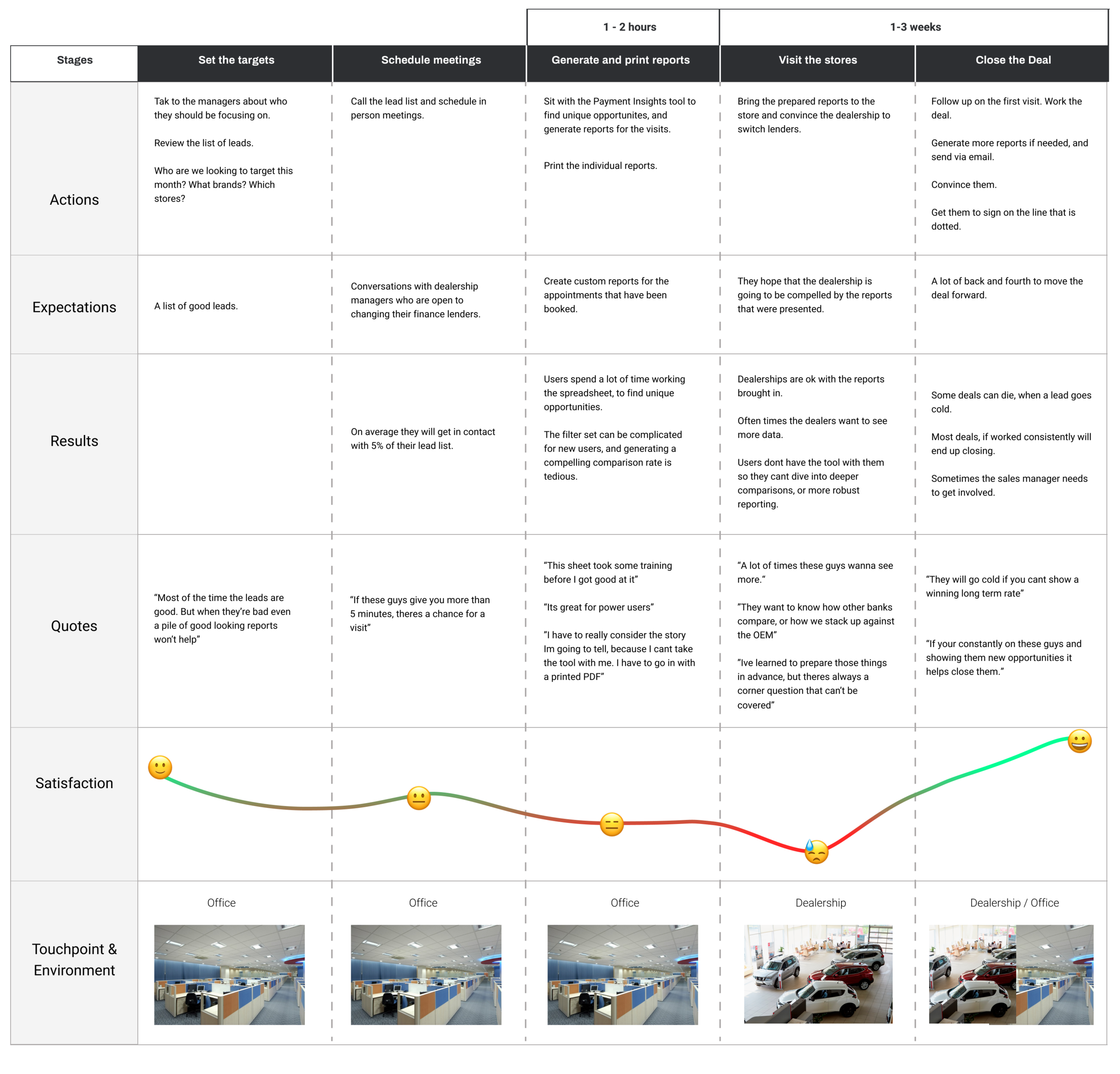
Understanding the current Workflow
We spent some time speaking with several of our current platform users to understand what their workflow looked like. Although each person had nuanced differences, we managed to summarize the workflow into some key steps.
Version 2
The second version of Payment Insights would aim to remedy the painpoints of the original and build from the feedback of it’s existing customer base. The main problems we needed to solve:
1 - Make the tool easier to understand
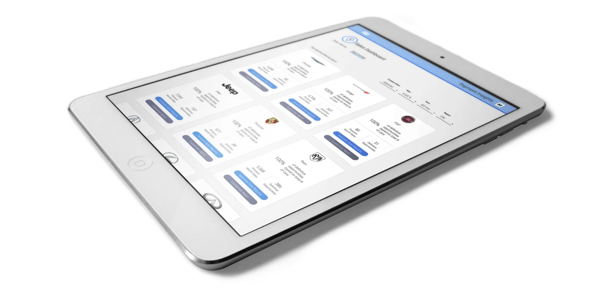
Instead of asking users to fumble through filters to find the best sales opportunities, our approach was to surface the most useful information in a visually driven dashboard. Show Kevin his best opportunities at a glance. This would let him focus on who he should visit that week and not the get lost in the numbers.


2 - Make it faster to work with.
Once Kevin had an understanding of where the best opportunities were, he would need the reports to prove it. In the previous version, he would have to sort through the cells, and complete a multi step process to generate the pdf’s needed for his meetings.
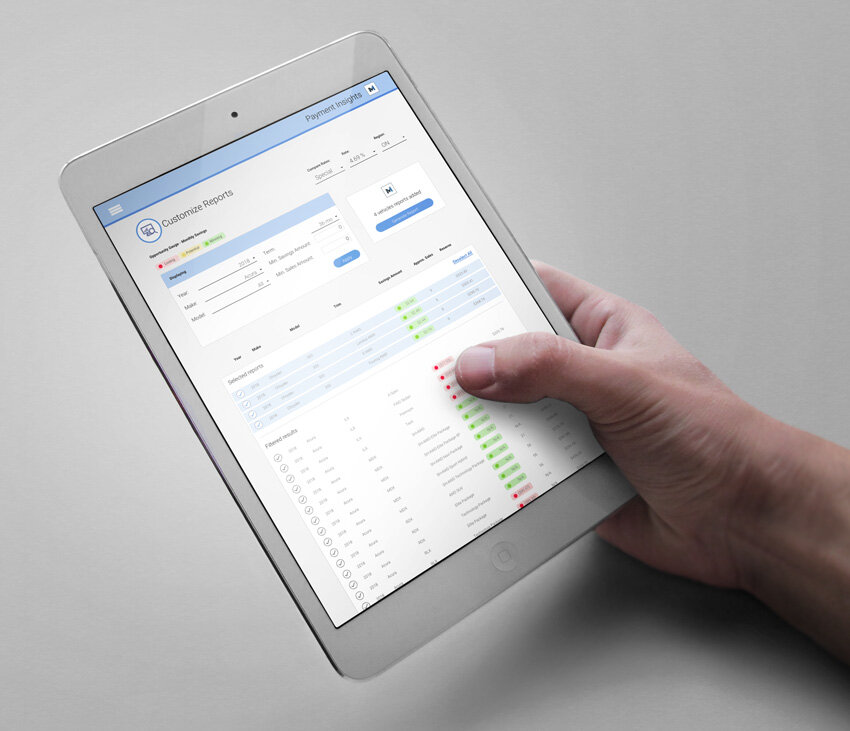
With Version 2 we automated that process. Allowing him to get the robust reports he needed with a couple of clicks. This tool was no longer for power users only.
3- Make it portable but keep it powerful.
Although we wanted to make it easier to use we also wanted to give our users the same power to customize reports, compare rates and have all of the previous version’s muscle, but take it on the road. This would let our users build reports on the fly and share them in real time with prospects. It cut down some of the weeks of back and forth that were in the current workflow.
Results
With the redesigned tool we were able to hit some important KPI’s: increased number of reports generated per month. A 100% retainment rate with all of our existing relationships. 4 new signed accounts to yearly liscences.
Increased yearly revenue, drinks all around. 🍻

Project contributors:
Design Lead, research: Allan De Los Angeles
Product management: Daniel de Repentigny
Product Owner: Mark Jorgenson
Development: Motocommerce Engineering team